Transforming spaces into places occurs with a huge variety of potential tools: inclusive public squares, gardens, community centres, wayfinding signage, neighbourhood character, and land-use regulations are just a few of the ways that cities can ensure that a neighbourhood is distinctive yet still very much a part of the city that it exists within. One city, Amsterdam, has a well-known overall character: narrow four-storey houses, an extensive canal system, small roads lined with Amsterdammertjes, and a creative population.
This isn’t necessarily the case in all of the city’s neighbourhoods. One such neighbourhood, Westerpark, tends to find itself left out of most city maps given to the hordes of travellers that visit the city each year. This is a real shame, as the neighbourhood is home to a number of sites, including the beautiful eponymous Westerpark, and one of the city’s premiere cultural hubs at Westergasfabriek (which, as the name suggests, was once a gas factory).
Besides more pronounced efforts to make Westerpark a unique neighbourhood within a world-class city, one element of architectural design is not quite as obvious, but certainly contributes to making a sense of place.
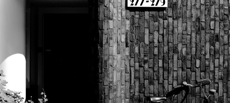
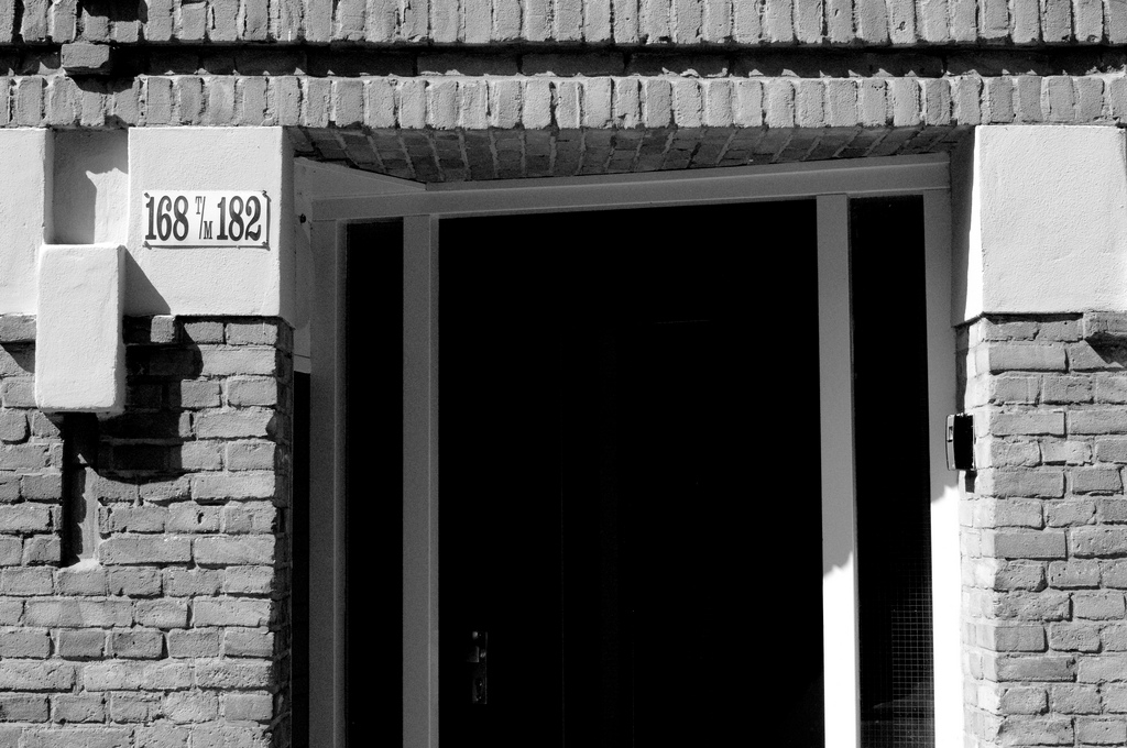
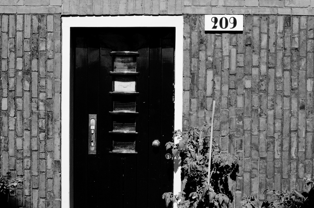
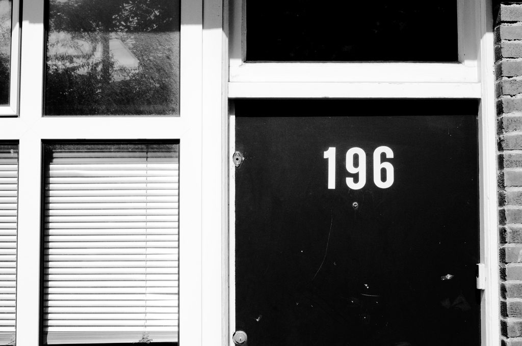
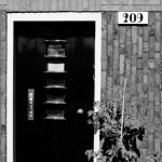
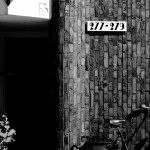
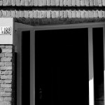
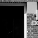
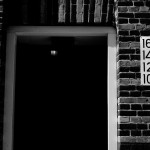
Subtle and precise font selection for building numbers is what seems to set Westerpark apart.
Art deco lettering and numbering at the Het Schip development underlines the grandiose-yet-collective ideals of the Amsterdam School of architecture, one that sought to fuse aesthetically pleasing design with the more practical concerns of bringing together a burgeoning urban population. Newer buildings with serifed fonts in the area also tend to recall the collectivity of Het Schip: a retro typography signals that a sense of community thrives here.
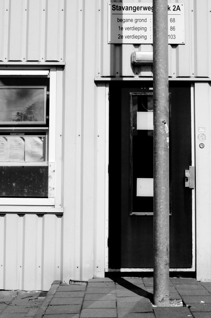
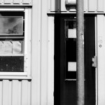
On the other end of the temporal scale, Westerpark is also home to an infamous set of student housing structures, colloquially referred to by residents and non-residents alike as ‘the containers’. Numbering on the buildings is minimal, with the exception of the signs placed over the main entrance doors to each building. The type is a familiar one: Helvetica, in varying weights, signifying to passersby that, even if the apartments themselves are of questionable quality, the population residing within them is likely to be younger, educated, and design-conscious.
The typographical diversity seen in Westerpark does not seem to spill over into the nearby neighbourhoods, where font usage is standardised, with exceptions coming at the luxurious canal homes within Amsterdam’s grachtengordel. While the fonts used on the canal homes emphasise the individuality (and, perhaps more likely, the depths of their savings account), the minutiae of Westerpark’s building façades subtly suggest the intricacies of the neighbourhood’s population.
You can view a full slideshow of images from Adam’s photographs from Amsterdam’s Westerpark neighbourhood on his Flickr account.

